(Brderless)
(Overview)
Brderless is a curated community for founders, based in New York and San Francisco.
(made with)
SvelteKit
WebGL
GSAP
Tailwind
Figma
Blender
Photoshop
( brief )
Brderless needed a site that could serve two audiences at once: prospective members applying to join, and potential partners considering sponsorship. To the founders audience, the branding and designs need to speak selectivity, quality, and timeliness of the right conversations, while encouraging new founders to enroll in events. To potential partners and sponsors, the visual elements, along with the copy, must communicate trustedness and effectiveness.
( solution )
The opening question was: “What do I want the viewers to feel?”.The direction I landed on was elite but not cold. The viewers should feel a sense of exclusitivity, but inviting. Greek statues bring that timeless, slightly untouchable quality. Editorial layout softens it, makes it feel like something you can walk into.
With the duality tension at play, the next question was how to solve it. How to keep the design from feeling too cold? Well, the micro-interactions. They’re small, but makes you feel like the site talks back to you. It doesn't feel like a closed door.
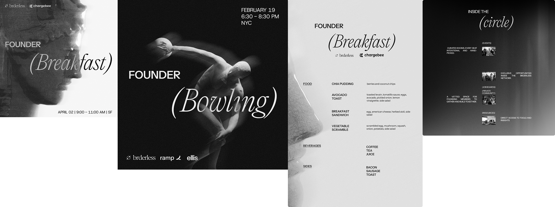
How to keep the design from feeling too accessible and generic? The layouts. A good example is the "Inside the Circle" section should've been a standard image grid, showing what being in the network is like. Instead it's alternating rows, texts and images trading places. Interestingly enough, it kind of resembles the backbone (feeling like my literature teacher now). You've seen enough sites to know what that section usually looks like. This one doesn't look like that.
Brderless Website:


Designed Brderless visual assets:
(Brderless)
Brderless is a curated community for founders, based in New York and San Francisco.